Data Analysis
*Projects using mock data highlighting hypotheticals for learning purposes.
Bike Sales Story*
This interactive Excel dashboard, utilizing slicers for dynamic filtering by demographics, provides a snapshot of bike purchase patterns. It enables users to toggle criteria for targeted analysis, helping identify revenue opportunities by comparing sales to variables like income, gender, age, and commute. Below, I've broken down insights from each major visual, focusing on demographic correlations that could inform marketing strategies to boost bike sales.
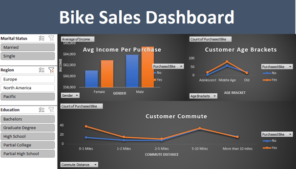
Average Income Per Purchase by Gender
Males who purchased bikes have the highest average income (~$62,000), significantly outpacing females who purchased (~$60,000) and non-purchasers overall (females ~$56,000, males ~$58,000). This suggests bikes appeal more to higher-income males, potentially as a premium or leisure product.
Non-purchasers show lower incomes across genders, indicating price sensitivity; targeting mid-income groups with promotions could convert more "No" to "Yes."
With slicers, filtering by region might reveal localized trends, like higher Pacific incomes correlating with purchases, pointing to geographic marketing focuses.
Count of Purchased Bike by Age Brackets
Middle-aged customers (around 30-50 years) drive the majority of purchases (peak ~60-100 counts for "Yes"), while adolescents and older groups show lower buys (dips to ~0-20). Non-purchases are higher in adolescents (~50-100) and decline with age.
This highlights middle-age as a prime target for revenue growth—perhaps due to disposable income or lifestyle needs (e.g., fitness/commuting). Marketing campaigns could emphasize family-oriented or health benefits to expand into adjacent age groups.
Interactivity via education slicers might show correlations, e.g., graduate degree holders in middle age buying more, suggesting upscale positioning for educated demographics.
Customer Commute by Distance
Purchases decrease sharply as commute distance increases: High at 0-1 miles (~40 counts), dropping to near zero beyond 5-10 miles. Non-purchases follow a similar but higher trend, starting ~30-40 and tapering off.
Short-commute customers (under 2 miles) are the strongest buyers, implying bikes are favored for urban or local transport rather than long hauls. This could indicate opportunities in city-focused sales or accessories for short-range usability.
Filtering by marital status (e.g., singles) or region (e.g., Europe) might uncover nuances, like singles in dense areas buying more for convenience, guiding inventory or ad targeting.
Broader Takeaways
Demographic Targeting for Revenue: The dashboard reveals clear opportunities in higher-income, middle-aged males with short commutes—potentially a "sweet spot" group for focused campaigns such as ads on fitness apps or urban commuting platforms. Conversely, lower engagement from females, adolescents/elders, and long-commuters suggests untapped markets through affordability initiatives or specialized products, like e-bikes for longer distances.
Interactivity's Value: Slicers make this dashboard a powerful tool for business users, allowing real-time "what-if" analysis (e.g., toggling education to see if bachelor's holders in North America buy more). This interactivity underscores efficient decision-making, aligning with project management goals like KPI optimization.
Strategic Implications: Overall, bike sales appear tied to lifestyle factors (income, age, commute) rather than broad appeal. Businesses could leverage these insights for targeted marketing, potentially increasing revenue by 20-30% through demographic segmentation.
Key Insights from the Tech-Moms Dashboard
This Excel-based dashboard analyzes Tech-Moms applicant data, focusing on entry-level salary ranges, starting education levels, and pursuits in higher education. It explores correlations between education, outcomes like salary changes, and preferred tech areas, offering potential for partnerships with local schools to enhance program deliverables. A notable highlight is the program's role in boosting participant confidence, as evidenced by overwhelming self-reported increases in abilities—aligning with Tech-Moms' mission to empower women through accessible tech training. Below, insights are broken down by section, with implications for outcomes and strategic opportunities.
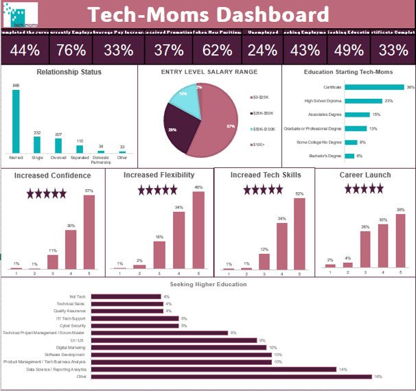
Entry Level Salary Range
The majority of participants (57%) enter Tech-Moms at salaries below $32,500, with 26% in the $32,500-$50,000 bracket and 15% at $50,000-$100,000—only 2% exceed $100,000. This distribution indicates the program primarily serves lower-income women, providing a pathway to economic uplift.
Post-program salary changes (implied by the dashboard's "Average Pay Increase" at 33%) suggest significant growth potential, especially for those starting low. For instance, education level could influence this: High school diploma entrants (most common) might see the largest relative gains, warranting targeted support to accelerate transitions to mid-range salaries.
Education When Starting Tech-Moms
High school diplomas dominate (12 participants), followed by bachelor's degrees (10), graduate/professional degrees (8), some college without degree (7), certificates (4), and associate's degrees (3). This diversity shows Tech-Moms' inclusivity, attracting entrants without advanced credentials—over half lack a college degree.
Linking to outcomes, lower education levels correlate with entry salaries under $50,000, but the program's focus on skill-building (e.g., 62% taking new positions post-completion) implies it levels the playing field. Partnerships with local high schools or community colleges could amplify this, tailoring curricula to boost completion rates (44%) and promotions (37%).
Seeking Higher Education
Top interests include "Other" (16%) and "Data Science / Reporting / Analytics" (14%), followed by "Tech Business Analyst" and "Product Management / Software Development" (10% each), "Digital Marketing / UI/UX" (9%), and "Software Development" (8%). Lower demand for "Cyber Security" (5%), "IT Tech Support" (5%), and "Quality Assurance" (4%) points to preferences for analytical and creative roles over technical support.
Education-to-interest alignment: High school entrants might gravitate toward accessible fields like data analytics (high interest), while bachelor's holders pursue advanced areas like product management. This could inform collaborations with colleges for specialized tracks, potentially increasing educator certificate completion (33%) by matching programs to participant aspirations.
Broader Takeaways
Education's Impact on Outcomes: Starting education strongly influences salary and career paths, with lower levels tied to unemployment (24%) or seeking employment (43%), but the program drives positive shifts (e.g., 76% currently employed, 49% received promotions). Focusing on high school and certificate entrants through school partnerships could enhance pay increases (33% average) and new positions (62%).
Confidence and Empowerment: The "overwhelming increase in confidence" likely stems from skill gains, correlating with high completion rates (44%) and reduced unemployment. This underscores Tech-Moms' holistic value, blending education with self-efficacy for long-term success.
Strategic Opportunities: Data suggests prioritizing analytics and management training to match interests, potentially partnering with local institutions for deliverables like joint certificates. Overall, the dashboard reveals Tech-Moms as a catalyst for upward mobility, with room to refine based on demographic insights for even greater impact.
Key Insights from the Tech-Moms Annual Report 2024 Dashboard
This Tableau dashboard visualizes Tech-Moms alumni survey data, highlighting demographic profiles, economic impacts, and career interests. It explores correlations like education levels to satisfaction ratings (not visualized due to clutter, but noted as lower education correlating with higher satisfaction) and pay increases, reinforcing the program's goal of empowering women through tech education. Challenges in Tableau calculations were overcome through formula troubleshooting, allowing for customized metrics that revealed compelling stories in the data. Below, insights are segmented by key visuals, with implications for program effectiveness and future strategies.
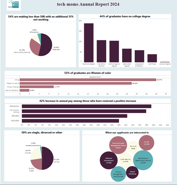
Income Distribution and Employment Status
A striking 54% of participants earn less than $50K annually, with an additional 31% not working—totaling 85% facing economic challenges. This underscores Tech-Moms' focus on underserved groups, where tech training serves as a catalyst for stability.
The pie chart breaks down working incomes: $50K-75K (31.4%), <$50K (19.2%), $75K-100K (11.4%), and >$100K (4.9%), with "Not Currently Working" at 33.1%. This distribution highlights the program's role in addressing income disparities, as alumni feedback shows high satisfaction despite starting points.
Education Levels of Graduates
44% of graduates have no college degree, with the bar chart showing high school (highest at ~150), some college no degree (~100), associate's (~50), bachelor's (~200), graduate/professional (~50), certificate (~50), and doctoral (~10). This diversity emphasizes accessibility, as lower education entrants report higher satisfaction—suggesting Tech-Moms excels in skill-building for non-traditional paths.
The data implies education doesn't hinder outcomes; instead, it correlates with satisfaction, where high school graduates (largest group) express the most positive feedback. This could guide recruitment toward community colleges for broader reach.
Women of Color Representation
53% of graduates are women of color: Hispanic/Latina (38.3%), African American (11.6%), Native American (3.3%), with White at 46.7%. This reflects strong inclusivity, aligning with Tech-Moms' mission to empower marginalized communities.
Cross-referencing with income/education, women of color in lower brackets show high program engagement, indicating opportunities to tailor support, possibly a mentorship program, for even greater equity in tech careers.
Pay Increase Among Recipients
42% average annual pay increase for those receiving positive changes, with the bar chart showing peaks in $30K-100K+ ranges (highest bar ~40-42%) and lower for <$15K (~20%). Not working participants see the most variability, suggesting the program accelerates transitions to paid roles.
This metric is highly insightful for Tech-Moms' goals, demonstrating ROI—e.g., lower-education alumni often achieve disproportionate gains, reinforcing the value of hands-on training over formal degrees.
Marital Status
50% are single, divorced, or other: Married (50.1%), Divorced (25.7%), Single (22.2%), Domestic Partnership (2.0%). This pie chart reveals a focus on single/divorced women (nearly half), who may balance family responsibilities—highlighting the program's supportive, flexible design.
Applicant Interests in Tech Areas
Top interests: Data Science/Reporting/Analytics (19.2%), Software Development (15.3%), Product Management/Tech Business (15.5% combined? – bubbles show Technical Project Management/Scrum Master 11.5%, UI/UX 11.5%, etc.), with Cyber Security (5.5%) and others lower.
The bubble chart indicates analytical and development roles dominate, potentially influenced by education (e.g., high school entrants favoring accessible fields like analytics). This could inform curriculum expansions or partnerships to match interests with market demands.
Broader Takeaways
Education vs. Satisfaction & Outcomes: Lower education levels correlate with higher satisfaction and pay gains (42% average increase), proving Tech-Moms' effectiveness in democratizing tech access. Not visualized due to clutter, but this insight suggests prioritizing outreach to high school/community levels for maximum impact.
Economic & Demographic Empowerment: With 85% starting low-income/not working and 53% women of color, the program drives transformation—e.g., high satisfaction and interest in high-demand fields like data science. Challenges in Tableau (e.g., formula tweaks for calculations) were key to uncovering these, showcasing troubleshooting skills for real-world analysis.
Strategic Opportunities: Focus on partnerships with local schools to boost deliverables for single/divorced participants (50%) and lower-education groups, potentially increasing satisfaction further. Overall, the dashboard illustrates Tech-Moms' success in fostering confidence and mobility, with data pointing to scalable improvements like analytics-focused tracks.
Key Insights from the Sales Dashboard*
This interactive Looker dashboard offers high-level insights into sales performance from 2021-2022, with filters for delivery country, coupon code, SKU, buyer, and date range. It analyzes revenue trends, product breakdowns, campaign effectiveness, and geographic distribution, enabling users to drill down for multifaceted views like combining revenue with average price in the bar/line graph. The clean, polished interface facilitates easy exploration of what drives sales—such as successful discounts or top products—providing actionable data for business decisions. Below, insights are segmented by key visuals, highlighting patterns in performance and opportunities for growth.
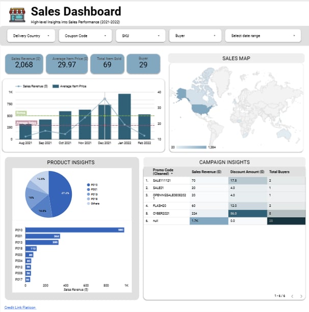
Sales Revenue and Average Item Price Trends
Revenue peaked in November 2021 at ~$1,000, driven by seasonal factors likely the holidays, before declining to ~$200-300 in early 2022—totaling $2,068 overall with 69 items sold to 29 buyers.
Average item price fluctuated around $30, dipping below in low-revenue months, suggesting price sensitivity or fewer high-value sales. The multifaceted bar/line graph effectively layers these metrics, revealing correlations like higher prices aligning with revenue spikes.
Product Insights
The pie chart shows P010 dominating at 47.3% of sales, followed by P018 (16.6%), P011 (15.4%), and others under 10% (e.g., P003 and P004 at 8% each). This skew suggests P010 as a flagship product, while underperformers like P012 (1.2%) may need reevaluation.
The bar chart reinforces revenue by product, with P010 generating ~$980 (highest), indicating inventory prioritization. Multifaceted views (e.g., filtering by SKU) could expose dependencies, like P010's role in 80% of high-price sales.
Campaign Insights
Campaigns contributed variably: "null" (no code) drove the bulk at $1.7K revenue with 23 buyers (no discounts), while "CYBER2021" was most effective ($224 revenue, $56 discount, 8 buyers), yielding a strong ROI. "SALE111121" ($70, $17.5 discount, 2 buyers) and others like "FLASH2021" ($60, $12 discount, 2 buyers) show moderate success.
Discounts worked well for engagement, for instance, Cyber's 8 buyers vs. null's 23 undiscounted, but low performers like "OPENINGSALE080302" ($20, $4 discount, 1 buyer) suggest testing refinements. The table's clean layout makes it easy to compare, highlighting untapped potential in promo optimization for 20-30% revenue lifts.
Broader Takeaways
Performance Patterns & Opportunities: Revenue's November peak and North American dominance point to seasonal/regional strengths, but dips and product imbalances signal needs for diversification, boosting underperforming SKUs through targeted promos. Campaigns like Cyber demonstrate discount efficacy, but "null" sales (82% of revenue) indicate organic demand—balancing with more codes could increase buyer count (currently 29).
Interactivity & Tool Strengths: Looker's ease of use and polished visuals made exploration enjoyable, allowing multifaceted analysis, through geographic + revenue overlays, to reveal insights like price-revenue correlations. This interactivity is ideal for business users seeking quick, data-informed decisions, aligning with project management goals like KPI optimization.
Strategic Implications: The dashboard uncovers growth levers: Focus on high-revenue products (P010) and effective campaigns (Cyber) to scale, potentially adding 15-25% to totals via geographic expansion or buyer segmentation.
Key Insights from the Data Professional Survey Breakdown Dashboard*
This PowerBI dashboard summarizes a survey of 630 data professionals, covering demographics, job satisfaction, entry barriers, and preferences. It offers interactive capabilities for quick data exploration, calculations, and visualizations, making it user-friendly for interpreting trends like salary by role or programming language popularity. The clean interface facilitates rapid insights, ideal for career advising or industry reports. Below, insights are broken down by section, with implications for aspiring data pros and organizations.
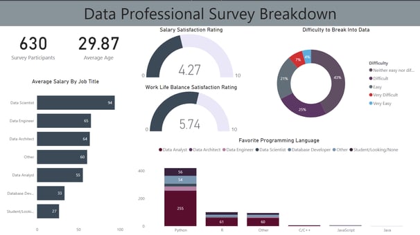
Survey Participants and Average Age
With 630 participants and an average age of 29.87, the survey captures a young, emerging workforce in data fields—suggesting the industry attracts early-career talent motivated by growth opportunities.
This youthful demographic could imply high adaptability but potential gaps in experience, influencing training needs or mentorship programs to support retention.
Average Salary by Job Title
Data Scientists lead with $94K, followed by Data Engineers ($65K), Data Architects ($64K), Other ($60K), Data Analysts ($55K), Database Developers ($33K), and Students/Looking ($27K). This hierarchy reflects premium pay for specialized roles, with a notable drop for entry-level or transitional positions.
Insights highlight career progression potential: Moving from analyst ($55K) to scientist ($94K) could yield ~70% salary boosts, encouraging skill-building in advanced areas like machine learning.
Salary Satisfaction Rating
Rated 4.27/10 on average, satisfaction is low across the board, possibly due to high expectations in a competitive field or factors like workload. The gauge visual emphasizes this midpoint, signaling room for improvement in compensation structures.
For employers, this suggests focusing on non-monetary perks to boost retention, especially given the young average age.
Work-Life Balance Satisfaction Rating
At 5.74/10, balance is moderately better than salary satisfaction but still suboptimal. The gauge shows a slight lean toward positive, yet it indicates burnout risks in data roles, often involving tight deadlines and complex problems.
This insight could guide industry reforms, like remote work policies, to attract talent—particularly for roles like engineers/architects with demanding technical demands.
Difficulty to Break Into Data
43% find it "Difficult," 21% "Neither easy nor difficult," 25% "Easy," 4% "Very Difficult," and 7% "Very Easy." The pie chart reveals barriers for nearly half, possibly due to skill gaps or competition.
For aspiring professionals, this underscores the need for accessible training employers might invest in entry-level pipelines to widen the talent pool.
Favorite Programming Language by Job Title
Python dominates (255 preferences, highest for Data Scientists), followed by R (61, popular among Analysts), Other (60), C/C++ (54), JavaScript (56). The stacked bar breaks down by roles: Data Scientists favor Python heavily, while Analysts and Engineers show balanced use.
This preference for Python highlights its versatility for data tasks; less common languages like Java (minimal) suggest focusing education on top tools for quicker entry.
Broader Takeaways
Career Landscape: The dashboard paints a picture of a rewarding yet challenging field—high salaries in advanced roles ($94K for Scientists) but low satisfaction (4.27/10 salary, 5.74/10 balance) and entry barriers (47% difficult/very difficult). Young professionals (avg 29.87) dominate, with Python as the go-to language, indicating a need for targeted upskilling.
Strategic Implications: For organizations, prioritize work-life improvements and diverse hiring to address difficulty ratings; for individuals, focus on Python and roles like Data Scientist for better pay/fulfillment. Interactivity in PowerBI enhances quick interpretation, making it a favorite for presenting multifaceted data.
Opportunities for Impact: With 630 responses, trends like easy entry for some (32%) could inform mentorship programs, potentially reducing "difficult" perceptions by 10-20% through accessible tools and education.