Data Projects
Here are some of the projects I have completed with a brief blurb about each one. For mor detailed analysis pop over to the analysis tab to see my insights.
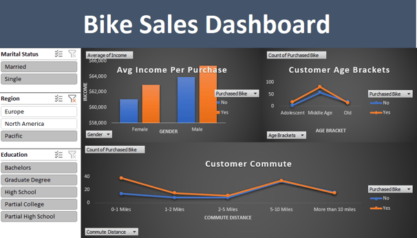
Project Insights: Excel
This interactive dashboard, built in Excel as my inaugural data visualization project, uses slicers to enable dynamic filtering by demographics. The goal was to analyze bike sales patterns against variables like income and region, uncovering target customer groups to inform revenue-boosting strategies. Key features include pivot tables for real-time toggling, allowing users to explore insights such as higher purchases among middle-aged, short-commute buyers—potentially guiding focused marketing efforts for 20-30% sales uplift in underserved segments.
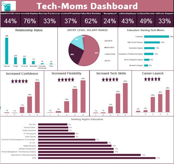
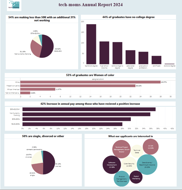
Project Insights: Excel
I had the opportunity to work with Tech-Moms applicant data in this Excel visual, exploring how entry education levels impact outcomes like salary changes and preferred tech areas. The analysis aimed to identify correlations—such as high school diploma entrants showing potential for significant growth—and uncover partnership opportunities with local colleges or schools to enhance program deliverables for participants. A standout insight was the overwhelming increase in confidence reported by participants, alongside trends like 57% starting below $32,500 in salary and 14% pursuing data science/analytics for higher education. This project highlights the program's role in empowering diverse groups, informing strategies to boost completion rates (44%) and economic mobility.
Project Insights: Tableau
In this Tableau project, I explored Tech-Moms alumni survey data to uncover patterns in education levels, satisfaction ratings, and career outcomes. Curious about whether entry education influenced satisfaction, I discovered an inverse correlation: Lower education levels (e.g., high school diploma at ~150 alumni) yielded higher ratings, though omitted from the final visual to avoid clutter. The 42% average pay increase among recipients was particularly insightful, reinforcing Tech-Moms' empowerment goals for underserved women (e.g., 54% earning <$50K, 53% women of color). Challenges arose in Tableau calculations, but troubleshooting formulas allowed me to derive meaningful metrics, highlighting the program's role in boosting confidence and economic mobility. This hands-on exploration fueled my passion for data-driven storytelling in community-focused initiatives.
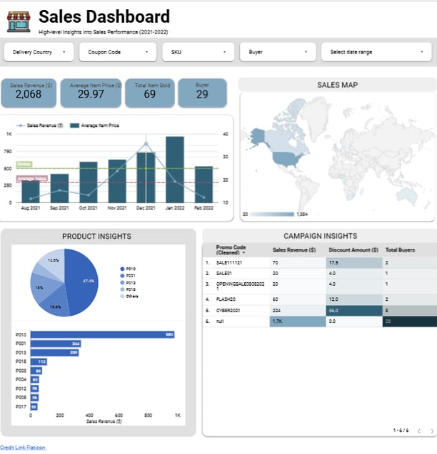
Project Insights: Looker Studio
This interactive dashboard in Looker Studio analyzes 2021-2022 sales performance, with filters for country, coupon code, SKU, buyer, and date to enable dynamic exploration. I appreciated Looker's ease of use and polished visuals, which made it enjoyable to uncover trends like effective discounts (e.g., Cyber2021 driving $224 revenue) versus underperformers, product dominance (P010 at 47%), and geographic concentrations (North America leading at 1,364 units). The multifaceted bar/line graph and map provided insightful overlays of revenue, price, and location, revealing opportunities for targeted campaigns to boost totals by 15-20%. This project highlighted how data visualization can transform raw metrics into strategic decisions for e-commerce growth.
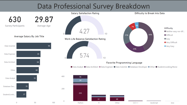
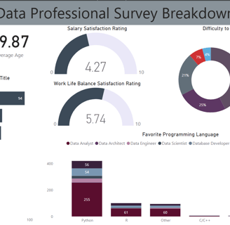
Project Insights: Power BI
In this PowerBI project, I explored survey data from 630 professionals, leveraging the tool's capabilities for calculations, visualizations, and interactivity—making it one of my favorites for user-friendly presentation. The dashboard highlights trends like low salary satisfaction (4.27/10) and Python's dominance (255 preferences), with gauges and pies for quick interpretation. I enjoyed how interactivity allows rapid insights into entry barriers (43% difficult) or role salaries (Data Scientists at $94K), informing career strategies or industry reports. This hands-on experience showcased PowerBI's power in transforming raw data into actionable, engaging narratives.